Marketing website redesign
Birds


New branding and optimised SEO to bring their products to a wider target audience.
New branding and optimised SEO to bring their products to a wider target audience.
New branding and optimised SEO to bring their products to a wider target audience.
Research
To kick off the redesign of Birds, a website that allows users to discover and book local birdwatching tours, I conducted user research to understand the motivations, preferences, and challenges of both the travelers and the guides. I used methods such as online surveys, phone interviews, user personas, and user journey maps to collect insights and define the problem space.
Storytelling
Based on the research findings, I crafted a story that depicted the main problem and the desired solution for the users. The story centered on how Birds could help users explore, compare, and reserve the best birdwatching tours in their area or destination. I used tools such as storyboards, user scenarios, and user flows to convey the story and the key features of the solution.

Design
Using the story as a framework, I designed low-fidelity wireframes and prototypes to test the usability and functionality of the website. I followed the principles of accessibility, aesthetics, and responsiveness to create a user interface that was easy to use and appealing to the eye. I used tools such as Adobe XD, Figma, and InVision to create and iterate on the design.
Iteration
I conducted several rounds of user testing and feedback sessions with potential and existing users of Birds. I used methods such as usability testing, expert review, and A/B testing to evaluate the design and measure its effectiveness. I gathered and analyzed the data and feedback to identify issues and areas for improvement. I then revised and enhanced the design based on the findings and suggestions.

Final product
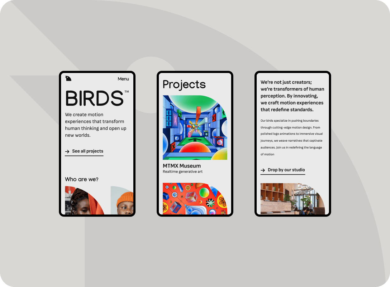
The final product of the website redesign was a user-friendly and attractive website that met the needs and expectations of both the travelers and the guides. The website enabled users to easily explore, compare, and book birdwatching tours, as well as to communicate and review each other. The website also increased the trust and loyalty of the users, as well as the revenue and growth of the business.
What I learned
Through this project, I learned a lot about the process and the skills of UX design. I learned how to conduct effective user research, how to create engaging stories and prototypes, how to test and iterate on the design, and how to deliver a high-quality product. I also learned how to collaborate and communicate with the stakeholders, the team, and the users. I enjoyed working on this project and I am happy with the outcome.
Research
To kick off the redesign of Birds, a website that allows users to discover and book local birdwatching tours, I conducted user research to understand the motivations, preferences, and challenges of both the travelers and the guides. I used methods such as online surveys, phone interviews, user personas, and user journey maps to collect insights and define the problem space.
Storytelling
Based on the research findings, I crafted a story that depicted the main problem and the desired solution for the users. The story centered on how Birds could help users explore, compare, and reserve the best birdwatching tours in their area or destination. I used tools such as storyboards, user scenarios, and user flows to convey the story and the key features of the solution.

Design
Using the story as a framework, I designed low-fidelity wireframes and prototypes to test the usability and functionality of the website. I followed the principles of accessibility, aesthetics, and responsiveness to create a user interface that was easy to use and appealing to the eye. I used tools such as Adobe XD, Figma, and InVision to create and iterate on the design.
Iteration
I conducted several rounds of user testing and feedback sessions with potential and existing users of Birds. I used methods such as usability testing, expert review, and A/B testing to evaluate the design and measure its effectiveness. I gathered and analyzed the data and feedback to identify issues and areas for improvement. I then revised and enhanced the design based on the findings and suggestions.

Final product
The final product of the website redesign was a user-friendly and attractive website that met the needs and expectations of both the travelers and the guides. The website enabled users to easily explore, compare, and book birdwatching tours, as well as to communicate and review each other. The website also increased the trust and loyalty of the users, as well as the revenue and growth of the business.
What I learned
Through this project, I learned a lot about the process and the skills of UX design. I learned how to conduct effective user research, how to create engaging stories and prototypes, how to test and iterate on the design, and how to deliver a high-quality product. I also learned how to collaborate and communicate with the stakeholders, the team, and the users. I enjoyed working on this project and I am happy with the outcome.

