Marketing website redesign
Maison


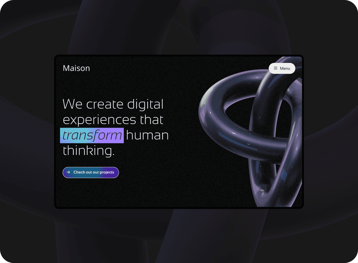
New branding and optimised SEO to bring their products to a wider target audience.
New branding and optimised SEO to bring their products to a wider target audience.
New branding and optimised SEO to bring their products to a wider target audience.
Research
Before embarking on the redesign of Maison, a website that helps users find and rent their ideal home, I conducted user research to understand the behaviors, needs, and frustrations of both the renters and the landlords. I used methods such as online surveys, phone interviews, user personas, and user journey maps to collect insights and frame the problem.
Storytelling
Based on the research findings, I crafted a story that portrayed the main problem and the desired solution for the users. The story revolved around how Maison could help users search, compare, and book their perfect home in a fast and easy way. I used tools such as storyboards, user scenarios, and user flows to illustrate the story and the key features of the solution.

Design
Using the story as a blueprint, I designed low-fidelity wireframes and prototypes to test the usability and functionality of the website. I followed the principles of minimalism, elegance, and responsiveness to create a user interface that was simple to use and pleasing to the eye. I used tools such as Adobe XD, Figma, and InVision to create and iterate on the design.
Iteration
I conducted several rounds of user testing and feedback sessions with potential and existing users of Maison. I used methods such as usability testing, expert review, and A/B testing to evaluate the design and measure its success. I gathered and analyzed the data and feedback to identify issues and areas for improvement. I then modified and enhanced the design based on the findings and recommendations.

Final product
The final product of the website redesign was a user-friendly and beautiful website that met the needs and expectations of both the renters and the landlords. The website enabled users to easily search, compare, and book their ideal home, as well as to communicate and rate each other. The website also increased the trust and satisfaction of the users, as well as the income and growth of the business.
What I learned
Through this project, I learned a lot about the process and the skills of UX design. I learned how to conduct effective user research, how to create captivating stories and prototypes, how to test and iterate on the design, and how to deliver a high-quality product. I also learned how to collaborate and communicate with the stakeholders, the team, and the users. I enjoyed working on this project and I am satisfied with the outcome.
Research
Before embarking on the redesign of Maison, a website that helps users find and rent their ideal home, I conducted user research to understand the behaviors, needs, and frustrations of both the renters and the landlords. I used methods such as online surveys, phone interviews, user personas, and user journey maps to collect insights and frame the problem.
Storytelling
Based on the research findings, I crafted a story that portrayed the main problem and the desired solution for the users. The story revolved around how Maison could help users search, compare, and book their perfect home in a fast and easy way. I used tools such as storyboards, user scenarios, and user flows to illustrate the story and the key features of the solution.

Design
Using the story as a blueprint, I designed low-fidelity wireframes and prototypes to test the usability and functionality of the website. I followed the principles of minimalism, elegance, and responsiveness to create a user interface that was simple to use and pleasing to the eye. I used tools such as Adobe XD, Figma, and InVision to create and iterate on the design.
Iteration
I conducted several rounds of user testing and feedback sessions with potential and existing users of Maison. I used methods such as usability testing, expert review, and A/B testing to evaluate the design and measure its success. I gathered and analyzed the data and feedback to identify issues and areas for improvement. I then modified and enhanced the design based on the findings and recommendations.

Final product
The final product of the website redesign was a user-friendly and beautiful website that met the needs and expectations of both the renters and the landlords. The website enabled users to easily search, compare, and book their ideal home, as well as to communicate and rate each other. The website also increased the trust and satisfaction of the users, as well as the income and growth of the business.
What I learned
Through this project, I learned a lot about the process and the skills of UX design. I learned how to conduct effective user research, how to create captivating stories and prototypes, how to test and iterate on the design, and how to deliver a high-quality product. I also learned how to collaborate and communicate with the stakeholders, the team, and the users. I enjoyed working on this project and I am satisfied with the outcome.

